What is the relationship between COVID deaths and presence of comorbidities and ICU admission in patients
Homework 2 Challenge 1
Let us revisit the CDC Covid-19 Case Surveillance Data. There are well over 3 million entries of individual, de-identified patient data. Since this is a large file, I suggest you use vroom to load it and you keep cache=TRUE in the chunk options.
# file contains 11 variables and 3.66m rows and is well over 380Mb.
# It will take time to download

# URL link to CDC to download data
url <- "https://data.cdc.gov/api/views/vbim-akqf/rows.csv?accessType=DOWNLOAD"


#Admission to ICU
covid_data <- vroom::vroom(url)%>% # If vroom::vroom(url) doesn't work, use read_csv(url)
  clean_names()

covid_data_clean <- covid_data %>%
 filter(death_yn %in% c("Yes", "No"),
        sex %in% c("Male", "Female"),
        icu_yn %in% c("Yes", "No"),
        age_group != "Unknown") %>%

  select(death_yn,age_group, sex, icu_yn) %>%

  group_by(age_group, sex, icu_yn) %>%

  summarise(death = sum(death_yn == "Yes"), total= n()) %>%

  mutate(death_rate = death/total)


ICU_deaths_plot <- ggplot(covid_data_clean,
                               mapping = aes(x = age_group,
                                y = death_rate))+
  geom_col(fill = "#FF9582")+
 facet_grid(cols = vars(sex),
             rows = vars(factor(icu_yn, ordered = TRUE,
                                 levels = c("Yes","No"),
                                 labels = c("Admitted to ICU",
                                            "Not ICU")))) +
  theme_bw()+
  scale_y_continuous(labels = scales::percent)+
  coord_flip()+
  geom_text(size=3, aes(label = round(100*death_rate,digits = 1),
                y = death_rate + 0.05))+
  labs(title = "Covid death % by age group, sex and whether patient was admitted to ICU",
       x ="",
       y="",
       caption = "Source: CDC")

ICU_deaths_plot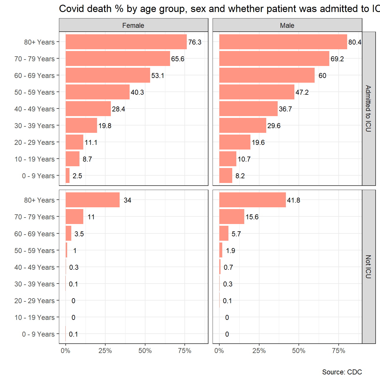
#save the picture
ggsave("ICU_yesno.jpg",plot=ICU_deaths_plot, width = 15,height = 10)

#place the picture in code
knitr::include_graphics(here::here("ICU_yesno.jpg"))
#effect of comorbidity

covid_data_clean_comorb <- covid_data %>%
 filter(death_yn %in% c("Yes", "No"),
        sex %in% c("Male", "Female"),
        medcond_yn %in% c("Yes", "No"),
        age_group != "Unknown") %>%

  select(death_yn,age_group, sex, medcond_yn) %>%

  group_by(age_group, sex, medcond_yn) %>%

  summarise(death = sum(death_yn == "Yes"), total= n()) %>%

  mutate(death_rate = death/total)


co_morbid_deaths_plot <- ggplot(covid_data_clean_comorb,
                               mapping = aes(x = age_group,
                                y = death_rate))+
  geom_col(fill = "#6B7CA4")+
 facet_grid(cols = vars(sex),
             rows = vars(factor(medcond_yn, ordered = TRUE,
                                 levels = c("Yes","No"),
                                 labels = c("With comorbidities",
                                            "Without comorbidities")))) +
  theme_bw()+
  scale_y_continuous(labels = scales::percent)+
  coord_flip()+
  geom_text(size=3, aes(label = round(100*death_rate,digits = 1),
                y = death_rate + 0.05))+
  labs(title = "Covid death % by age group, sex and presence of co-morbidities",
       x ="",
       y="",
       caption = "Source: CDC")

co_morbid_deaths_plot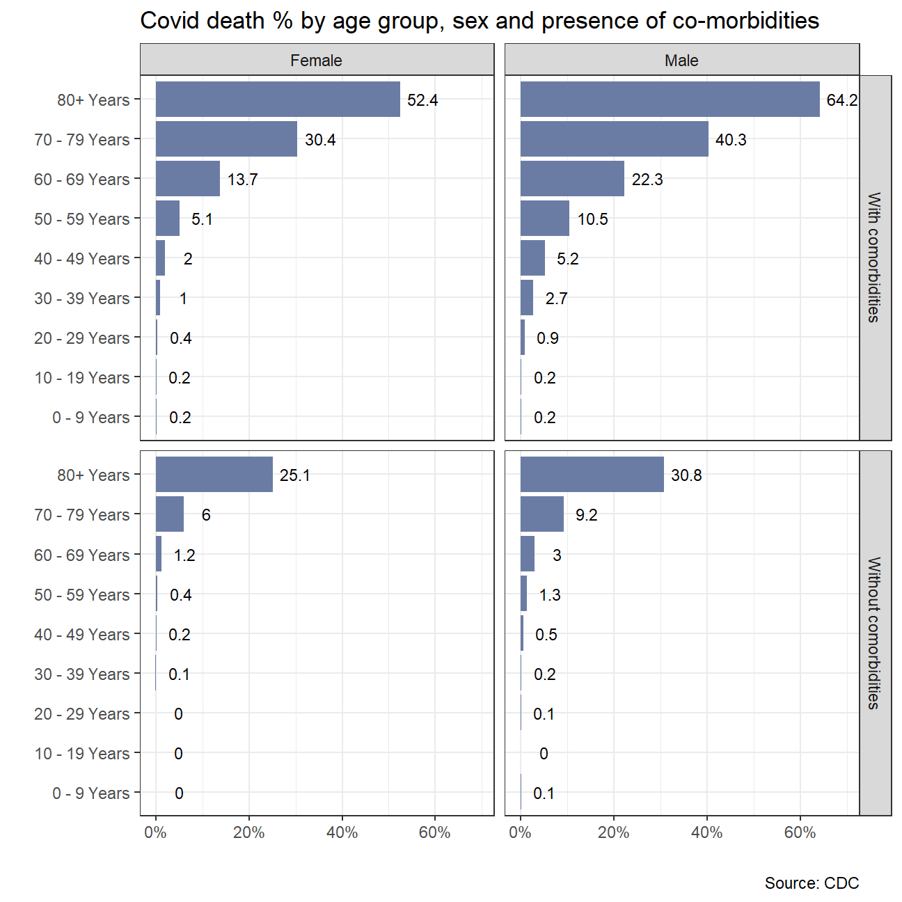
#save the picture
ggsave("co_morbidities.jpg",plot=co_morbid_deaths_plot, width = 15,height = 10)

#place the picture in code
knitr::include_graphics(here::here("co_morbidities.jpg"))